How Can We Help?
Recommendations Performance
How do I evaluate the performance of my Recommendations pipeline?
Once you’ve built a Recommendations pipeline, Cortex makes it easy to explore results and learn more about your pipeline’s predictive power. In this guide, we’ll show you how to evaluate the performance of a Recommendations pipeline in Cortex.
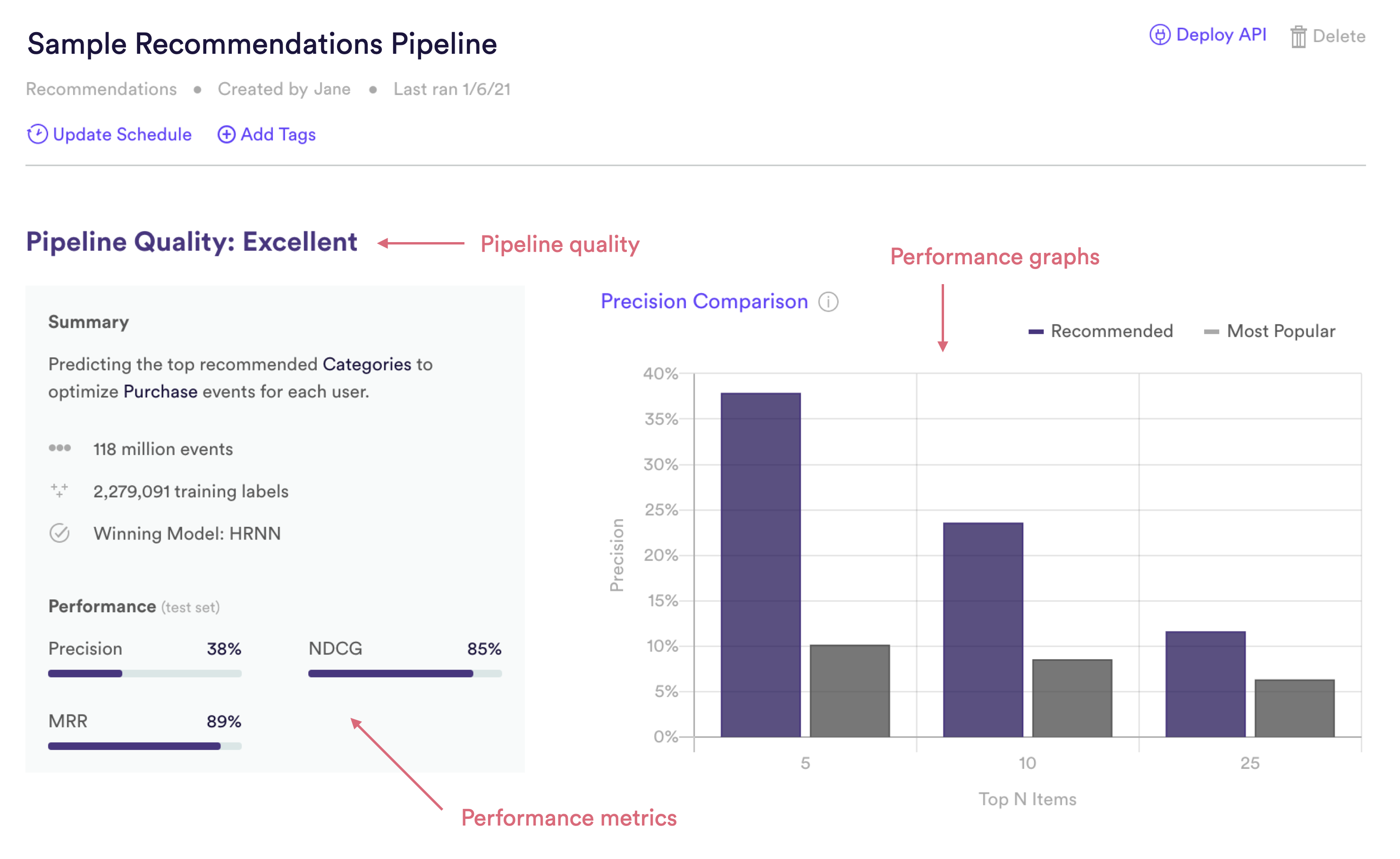
Cortex summarizes performance of any pipeline in three ways: Pipeline Quality, Performance Metrics, and Performance Graphs. The following sections describe how to interpret each of these specifically for a Recommendations pipeline.

Recommendations Quality
Pipeline Quality gives you a quick sense for your pipeline’s performance without having to scrutinize any technical metrics. A pipeline’s Quality is meant to serve as a rough guide for how well its predictions match reality, but in truth what constitutes good performance depends on the difficulty of the problem – sometimes “Average” actually represents the best possible performance that can be achieved with the data at hand.
For Recommendations, Pipeline Quality is determined based on NDCG (Normalized Discounted Cumulative Gain), a common measure of performance for learning-to-rank machine learning problems. Specifically, Cortex measures Pipeline Quality by looking at how the NDCG of your pipeline’s top 5 recommendations compares to the NDCG of the top 5 results from a non-personalized baseline (“More Popular”). NDCG is described in more detail in the Metrics section below.
| Pipeline Quality | Precision Improvement over Baseline |
| Excellent | >75% |
| Very Good | 50-75% |
| Good | 25-50% |
| Average | 10-25% |
| Below Average | <10% |
Recommendations Performance Metrics
Cortex publishes three well-known performance metrics for each Recommendations pipeline. Each of these metrics is computed on a test set — that is, a random collection of users withheld from training so that we can measure performance on data that your pipeline has never seen before. Recommendations for the test set are also wound back in time so that we can compare them against which users actually went on to interact with which items.
To frame these metrics in real terms, consider a Recommendations pipeline, which ranks six product categories in the optimal order for each user. These pipelines made the following recommendations for test set User 123, who ended up interacting with Categories A and C. These categories are considered “relevant” to the user.
| #1 Recommendation | Category A |
| #2 Recommendation | Category E |
| #3 Recommendation | Category C |
| #4 Recommendation | Category F |
| #5 Recommendation | Category B |
| #6 Recommendation | Category D |
Precision
What percentage of each user’s top 5 recommended categories were relevant, on average? For example, User 123’s recommendations have a precision of 40%, since User 123 ended up engaging with 2 out of their top 5 recommendations (2/5 = 40%).
NDCG
NDCG (which stands for Normalized Discounted Cumulative Gain) is a metric which summarizes how accurately your pipeline’s recommendations are ranked on average for each user. The higher that each relevant item appears in the ranked list of the user’s recommendations, the higher your pipeline’s NDCG score. In other words, your pipeline gets more credit for getting its top recommendation “correct” than it does for lower-ranked recommendations. Read here for more details.
NDCG ranges between 0-100%, where a score of 100% means that every relevant item was ranked before every irrelevant item for every user. Our example pipeline has an NDCG score of ~92% for User 123. If instead Category C had been ranked as the #2 recommendation, NDCG would have been a perfect 100%, since no irrelevant categories would be ranked ahead of either Category A or C.
MRR
MRR (which stands for Mean Reciprocal Rank) is a metric which summarizes, on average, how far down the list of recommended items you need to go before you reach a relevant item. Our example pipeline has a perfect MRR score of 100% for User 123, since the user ended up engaging with their #1 ranked recommended category. Read here for more details.
Recommendations Performance Graphs
Like the performance metrics described above, performance graphs are generated based on data from a test set — that is, a random collection of users withheld from training so that we can measure performance on data your pipeline has never seen before. Recommendations for the test set are also wound back in time so that we can compare them against which users actually went on to interact with which items.
Precision Comparison Graph
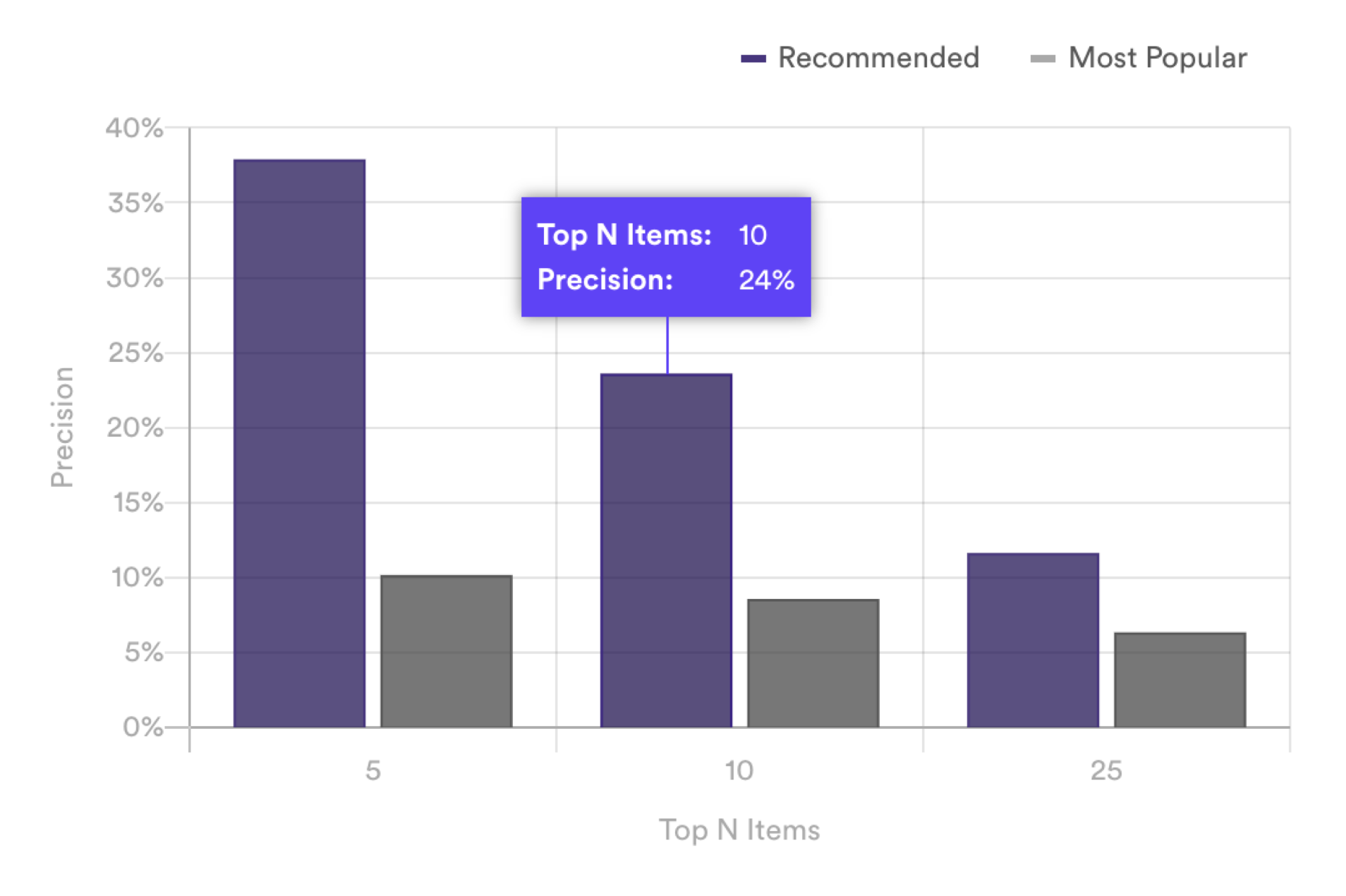
The Precision Comparison graph measures how precise your pipeline’s recommendations are compared to a non-personalized baseline. To calculate precision for the top N recommended items, Cortex measures the percentage of those recommendations that each user ended up interacting with. For example, a precision of 40% for the top 5 items means that on average, each test set user engaged with 2 out of their top 5 recommendations (2/5 = 40%).
Precision is calculated for the for your pipeline’s personalized recommendations as well as for a baseline of “Most Popular” items. This baseline is created by finding which items were most popular in the past, and recommending those items to every user. The comparison shows you how personalized recommendations perform relative to a non-personalized approach.

This graph measures performance for the top 5, 10, and 25 recommended items from your pipeline. If there are 5 or fewer total items available for your pipeline to recommend, the Precision Comparison graph will show no difference between personalized vs. non-personalized performance (since the top 5 recommendations for each approach will contain the same items). However, your pipeline may still be outperforming the non-personalized approach in terms of ranking those items. If this is the case, then Pipeline Quality and ranking metrics like NDCG and MRR will provide a clearer sense of your pipeline’s performance.
Related Links
- Building a Recommendations Pipeline
- Future Events Pipeline Performance
- Uplift Pipeline Performance
- Look Alike Pipeline Performance
- Classification Pipeline Performance
- Regression Pipeline Performance
Still have questions? Reach out to support@mparticle.com for more info!